For the print aspect of the module I wanted to continue on the same theme as my video. I wanted continuity between the two projects rather than having two separate pieces.
With my video being based on 1930s clothing, I thought the print aspect lent itself well to a fashion publication/magazine. I didn't think the clothes were abstract enough to be large scale prints on their own, and having several items would work well as a collection.
Vintage Fashion
1930s Fashion
Fashion Zine/catalogue
1930s clothing vs modern day clothing
I looked into the style of the photographs and adverts in magazines in the 1930s.
Feedback from my tutorial was to take a new collection of photographs of the clothing I had made for the video. We also talked about the idea of a giving the photo shoot modern twist - 1930s fashion with a hint of 2012.
- Standing in the bear ravine wearing an outfit and Beats headphones
- Outside the zoo entrance in the new style Mini car
- Holding a ipad
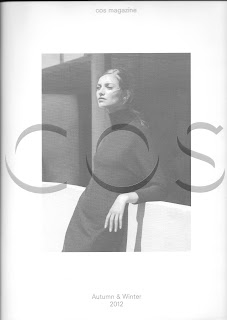
I came across the latest COS (clothing store) magazine, and it was very similar to what I had in mind for the magazine which I wanted to create.
They have interviews with artists/journalists/photgraphers etc as well as displaying the latest collection of clothing. There were several sets of photographs inside the magazine to showcase the different collections of clothing.
I really liked the style of print for the magazine - a glossy cover, with matt paper inside.
Ironically, one of the clothing collections inside this issue was photographed at Le Corbusier's Unite d'Habitation! These photos in particular inspired the style of my magazine - a mixture of colour & black and white photos.


No comments:
Post a Comment