21 April 2013

City Scene-Pop Up!

I would like this product to be for sale in a tourist information centre, or art gallery gift shop, as a high-end, niche gift or souvenir.

(I tried to get photographs in this shop environment but the tourist information centre were unable to help me as they were busy and didn't really have the space to display it.  I also tried the 'Made In Birmingham' shop in the Mailbox, but the only chance I could get there on the monday the store was closed.  The finishing touches took longer than I expected which is a shame, and the deadline the following day meant that was my only opportunity to get to the shop.)


City Scene-Pop Up! on display in a home environment:


www.cityscenepuppet.blogspot.co.uk

As explained along the way, if I were to improve this product, I would change the materials used.  I like the idea of making it an eco-friendly product made from recycled materials, and I would focus more time on the backdrops to smarten up the final product.

I like the QR codes and how they link to a blog with information - bringing in a modern touch.  I would like to expand further and create different cities - either as an 'Add-On' kit, or exclusively available from  the relevant city/country. 

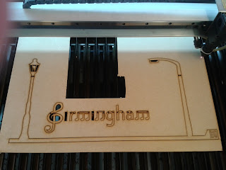
I would put a skyline/logo on the lid (etched by laser) rather than leaving it blank - particularly as the piece of MDF used was not as good quality as I would have liked.  It has a few marks/rough patches which ruins it's finish.  

I would experiment with trying to stain/paint the box & puppets - I like the 'Raw' quality to the project as it is at the moment and did not want to risk ruining it with bad painting/staining.  I thought paint could make it look more child-ish & tacky, rather than a niche product I am trying to design.  Unfortunately I ran out of time and resources to experiment with the colour and could not afford to risk it going wrong. 

I would also try and market the idea to shops/suppliers to see whether this could actually be a marketable product.  I would have liked to make a music video/advert to support the product.

Final Display R308

Final Display R308

19 April 2013

Making 2....

As my idea is for a commercial product, I decided to put the brand on the bag so that when it is being transported it is also being advertised!

I looked into a few bag designs, and the brand name/logo are quite large to stand out.


I like how the website is included on this bag.
As a large aspect of my product is linked to a blog then this would work well on my design.


I did a few designs to experiment with the layout...

I like the front of this design, as the logo is to the left, when being carried it would not be covered up by your arm.


I like the back of this design, how the website has been included under the skyline.


I have also designed and made an instruction/welcome leaflet to go inside the bag.

This includes information on the contents included, and instructions for the QR codes etc.

It is printed on brown paper to match the 'raw-ness' of the box/puppet/canvas bag & the eco-friendly aspect which I would ideally like to make my product.

Instruction leaflet which will come in the bag with the product


My idea is to have changeable backgrounds.  For the project I have used mount-board for a plain black/white reversible backdrop.

Black backdrop
Black backdrop in use
White backdrop
White backdrop in use
Skyline backdrop
Skyline backdrop in use


If I had time to develop this further I would have a backdrop 'Add-On' kit - people could buy a selection of backdrops - different weather/scenery photographs of Birmingham, or abstract backdrops such as unique art painted by people from Birmingham.

I was unsure whether photograph backdrops would match the very linear style puppets, so I stuck to black/white/skyline.  I created an illustrator drawing of a cloud backdrop, but not sure that this really matches.
If I had more time, the backdrops is definitely part of the project that I would pay more attention to as it is quite a vital part of the overall look - this could make a difference between the product being a niche market product, or a childrens toy/cheap souvenir.

Illustrator drawing of cloud backdrop - this is too cartoony

17 April 2013

Making 1...

Due to the shape of the box - the 'lid' of the product is thinner to allow space for the changeable backdrops - it was going to be very difficult to attach handles to the top edge.  

Instead I decided to make a bag.  This also adds slight protection to the product when being moved, and also provided more storage space for the puppets and backdrops - the straps can be carried or are long enough to fit over your shoulder.  

As the puppet box is made from MDF and has a raw look about it, I decided to make the case out of calico to match this raw feel about it.  Ideally I would have the whole product as eco-friendly and all materials including the case would be made from recycled products.  

Test bag - practising making a bag with a 'gusset' and a bag that is made to measure.


Originally I had 20 'puppets' which I was going to get laser cut.

Problem 1!

My practice puppet - the bull (see previous post) had 2 QR codes - a large one, and also a smaller one which would fit within the measurements of the handle - both could be scanned & linked to the blog perfectly...However the bull was enlarged for some reason unknown at the time, so when it came to cutting the final puppets out I decided to test the QR codes again at the correct (slightly smaller) size....we could not get it to work at all!

We spent over 6 hours trying different methods to get the QR codes to work - changing the speed/power of the laser - we cleaned the machine - used different pieces of MDF - used perspex - changed the focus of the laser - changed the size of the QR code...

QR code testing 1
QR code testing 2
Even tried using different material. However this didn't
work as the QR code scanner 'reads' the dark/light spaces.
The largest QR code in the middle is the only one we could get to work.
In the end I had to change the design of the puppet handle to fit.

New handle design

This actually worked out better than the original design as the rest of the
 handle sits flush in the channel - this tab allows the user to slide
the puppet across the entire channel much easier.

Problem 2!

I had a few problems getting my designs into the laser-cutter software.  You have to transfer them to DXF files.  Some it would import fine - others it would not!
All files have been made the same way - so I had to transfer the design into another software and save it as a PLOTTER file.  However, when I transferred the design it enlarged it slightly (I now know this is why my test bull design was bigger than intended).  Again we spent over 6 hours trying to solve as the majority of my DXF files could not be imported... we tried a number of different methods and in the end I had to reduce the size of each puppet in this new software to the correct size.  Unfortunately in the process I didn't quite get the size of the tab on the handle quite correct, so some tabs are slightly different sizes!

As a result, I had to reduce the number of puppets I originally wanted to cut out.  I didn't have the time to spend adjusting the sizes and there were lots of people waiting to use the software and the machine and I couldn't take up any more time.  Unfortunately some of these were iconic and significant landmarks/buildings but had I realised this sooner I would have planned which puppets did/did not get cut.  

For the puppets I could not get laser cut - I changed on the cityscenepuppet  blog to 'COMING SOON' items!  


I had planned to create several more 'moving puppets' - my abstract wheel was a test piece - 2 parts cut separately and joined using a split pin - however due to the problems occurred I was unable to get any more puppets cut.  

Unfortunately in the last week I accidentally dropped the box - bashing the bottom corner & knocking out the hinges.
The hinges I glued & screwed back in, but unfortunately the corner could not be fixed, but it is fairly small cosmetic damage. 
I added hook & eye latches on each side, so that the product can be
closed and kept neatly together when being transported or not in use.
I used 90-degree hinges so that the lid can stay upright and act as a backdrop.
I created 2 'stays' which are inserted on the corners to help support the
hinges and to stop the lid closing down on the puppets, or trapping
any fingers.  They do not lock the hinges open, but just help to support it.
They easily push into the corners and can be stored inside the lid with the rest of the puppets. 

Ideally I would like to have etched the skyline on to the lid of the box, to make it visually more attractive, but this is something that should have been done initially before I started gluing bits together & attaching the hinges.  It was too much of a risk to attempt this at a later stage incase it didn't work.


Brand Logo


I decided on the brand name:  City Scene-Pop Up!

I could have spent hours trying to come up with something more catchy, but I wanted to keep it is simple and make the name & logo match the product.  

For the logo I took some of the key features of the Birmingham skyline - aspects of both the landmarks & the culture behind the city.  I incorporated 'Pop Up' as though it is on one of the puppet sticks.

9 April 2013

Marketing 1

As my idea is for a commercial product I decided to make some marketing material to go with it.

I made a design for a skyline logo using some of the puppet illustrations I have drawn:


As music was the original starting point for this project, and at the heart of the city, I stylised the city name to reflect this.


5 April 2013

Research

I looked into other souvenirs/products along a similar line to mine:

Products by Kidsonroof:
This company makes wonderful productss/toys out of recycled card board (amongst few other things) in a similar 'pop-out' way to my design idea.

Kidsonroof wishes to re-connect modern life with nature, rediscovering basic values. Kidsonroof offers an ecological approach to the act of playing. Stimulating creativity and imagination lies at the heart of Kidsonroofs products.

http://kidsonroof.com/new/

Pop-out cardboard city


Other products:
Pop-out cardboard boats/animals that you piece together as a 3D Jigsaw.


This website not only has an interesting blog, but has the ability for you to design and make 2D and 3D  laser cut cardboard designs.  

It has not happened in the design for this project - but looking back I think it would be nice to make my product as eco-friendly as possible - Using recycled materials where possible.  Birmingham is a city which is always trying to encourage citizens and businesses to be as eco-friendly as possible and I think this product would have worked well (and retailed well) if made eco-friendly.